
Spring decorating isn’t just about applying pastels everywhere. If you want a welcoming home, focus on colors inspired by nature. The right spring home colors will brighten your space without feeling overwhelming. Earthy greens, golden yellows, and soft neutrals bring warmth and keep things balanced.
Whether you’re giving a room a fresh coat of paint or adding decorative accents, these spring home shades will help you achieve a comfortable, lived-in look. Let’s explore how to apply them throughout your home.
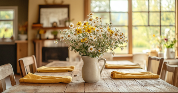
Freshen Up Your Space with These Inviting Spring Home Colors
Spring is the perfect time to refresh your home with warm, natural, and timeless colors. Instead of traditional pastels, consider shades that add depth and character while keeping your space inviting. Whether you’re looking for a bold statement or just need subtle accents, these handpicked hues bring a fresh, effortless feel to your home this season.
🌿 Earthy Greens: A Natural Refresh
Green instantly connects a home to the outdoors, making it a perfect choice for spring. However, bright greens can feel overpowering while muted shades create a calming effect.
- Olive Green: Deep and understated, this shade blends well with wood tones and vintage accents. Use it on painted cabinets, upholstered chairs, or entryway walls.
- Sage Green: Light and airy, sage green adds a subtle pop of color without dominating the space. It works beautifully in kitchens, bedrooms, or as a front door shade. Check out these inspiring sage green home decor ideas.
- Deep Forest Green: A darker, dramatic option that pairs well with neutral backgrounds. Try it on built-in bookshelves, accent walls, or statement furniture pieces.
If painting isn’t an option, introduce green through decor. Throw blankets, ceramic vases, and leafy plants add depth and a natural feel without a major commitment.
☀️ Warm Yellows: A Bright and Cheerful Accent
Yellow brings energy into a space, which makes it an excellent choice for spring. Instead of pale pastels, opt for richer tones that add warmth and dimension.
- Mustard Yellow: A deep, golden hue that works well in living rooms and dining areas. It pairs beautifully with wood furniture and neutral upholstery.
- Honey Gold: Softer than mustard, this shade creates a cozy atmosphere without overwhelming a room. Use it for decorative accents, wall art, or lighting fixtures.
- Buttercream Yellow: A delicate, creamy shade blends seamlessly with whites and beiges. Ideal for bedding, curtains, or painted trim.
Add some yellow to your home via fresh flowers, patterned rugs, or textured pillows. Even small pops of color can brighten a space without making it too bold.
🤎 Soft Neutrals: A Timeless Foundation
Neutrals provide a balanced backdrop that allow other colors to shine. For a softer look, choose shades with warmer undertones instead of stark whites or cool grays.
- Warm Beige: A classic, adaptable color that pairs well with both bold and muted tones. Use it for walls, large furniture pieces, or area rugs.
- Greige (Gray + Beige): This blended hue keeps spaces light while adding depth. Ideal for open-concept living areas or transitional spaces.
- Soft Taupe: A slightly deeper alternative to beige that works well in upholstery, drapery, or accent walls. It adds warmth without overpowering the room.
Layering neutral tones creates dimension while maintaining an effortless, put-together look. Pair them with different textures like woven fabrics, linen, and wood for added interest.
Bring Spring Home Colors Into Your Space
Refreshing your home doesn’t have to mean following trends all the time. Using spring home colors like earthy greens, golden yellows, and soft neutrals can create a fresh and inviting space. Whether you’re painting a wall or swapping out decor, these shades will add warmth without feeling overwhelming.
Which color are you excited to try? Drop a comment below and let’s chat!
FAQs
1. What are the best spring home colors for a natural look?
Earthy greens, golden yellows, and soft neutrals create a fresh yet grounded feel. These shades work well with natural materials like wood and linen.
2. How can I add spring colors without repainting?
Use throw pillows, blankets, curtains, and artwork in seasonal shades. Adding fresh flowers, ceramic vases, or patterned rugs also works well.
3. Is green a good color for small spaces?
Yes! Light greens, like sage, make a room feel airy and open. Darker greens, such as forest green, work well as accents to add contrast.
4. Which neutral shades work best for spring decor?
Warm beige, greige, and soft taupe provide a versatile backdrop. These tones pair well with greenery, natural wood, and golden yellow accents.
5. What colors complement earthy greens?
Terracotta, burnt orange, and golden yellow enhance green’s warmth. Soft creams and warm wood tones also pair beautifully with natural greens.
6. Can I mix pastels with deeper tones?
Yes! Soft pastels contrast beautifully with rich, earthy shades. Try a muted blush pink with olive green or a pale blue with honey gold.
7. What’s the best way to use yellow in home decor?
Introduce yellow in small touches, such as throw pillows, wall art, or floral arrangements. Mustard or buttercream yellow also works well on furniture or trim.
8. What materials enhance these spring colors?
Natural materials like linen, woven baskets, rattan, and reclaimed wood add texture and warmth to these color schemes.
9. What wall colors work well with wood furniture?
Soft neutrals like warm beige, greige, and sage green complement wood furniture while keeping the space light and balanced.
10. How can I update my home for spring on a budget?
Swap out textiles like blankets and pillow covers for fresh spring hues. Adding thrifted decor, seasonal flowers, and nature-inspired artwork also makes a big impact.
